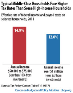
One chart by our colleagues at the Center on Budget and Policy Priorities (CBPP) that uses data from the Tax Policy Center (TPC), is all President Obama needs to show why he’s right in proposing to raise federal taxes on the wealthiest Americans (the so-called “Buffett Rule” ).

As CBPP notes, the chart shows that a significant group of very wealthy people pay a smaller share of their incomes in federal income and payroll taxes than a large swath of the middle class. How can this chart be so? It is simple: the federal capital gains and dividends tax rates are low compared to the income tax on work paid by the middle class, and wealthy people pay payroll taxes at a much lower rate than middle-class Americans.
Read The Case for the Buffet Rule in One Chart (a short blog post) and study the chart and come back here to discuss.
This post was originally published on www.blueoregon.com on September 21, 2011. The original post can be found at http://www.blueoregon.com/2011/09/one-chart-shows-obama-right-about-buffet-rule/.
More about: bush tax cuts, capital gains, personal income tax


