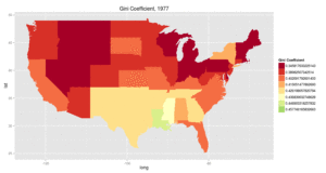
The Washington Post recently featured a great animated graphic created by John Voorheis, a University of Oregon graduate student, that shows the growth of income inequality from 1997 to 2012. The Post column picked it up from the blog of U of O economics professor Mark Thoma, Economist’s View.
The map shows the state-by-state changes in a measure of inequality (the gini coefficient), with red being less inequality and green being more inequality. The blog post includes other animated maps based on other measures of inequality, and Voorheis created a set with a better color scheme that can be found here.

You can learn all there is to know about income inequality from the new film featuring former US Labor Secretary Robert Reich, INEQUALITY FOR ALL.
While INEQUALITY FOR ALL is opening in theaters on 9/27, if you act fast you might be able to get tickets to a special advance screening in Portland on 9/26 sponsored by OCPP and a number of other organizations concerned about the issue.
This blog post was originally posted on www.blueoregon.com on September 21, 2013. The original post can be found at http://www.blueoregon.com/2013/09/oregonian-shows-growth-income-inequality/.


